A clear path through the site
Pages are built with landmarks, ordered headings, visible links, and a skip link so visitors can move through the site without having to watch every animation or use a pointer.
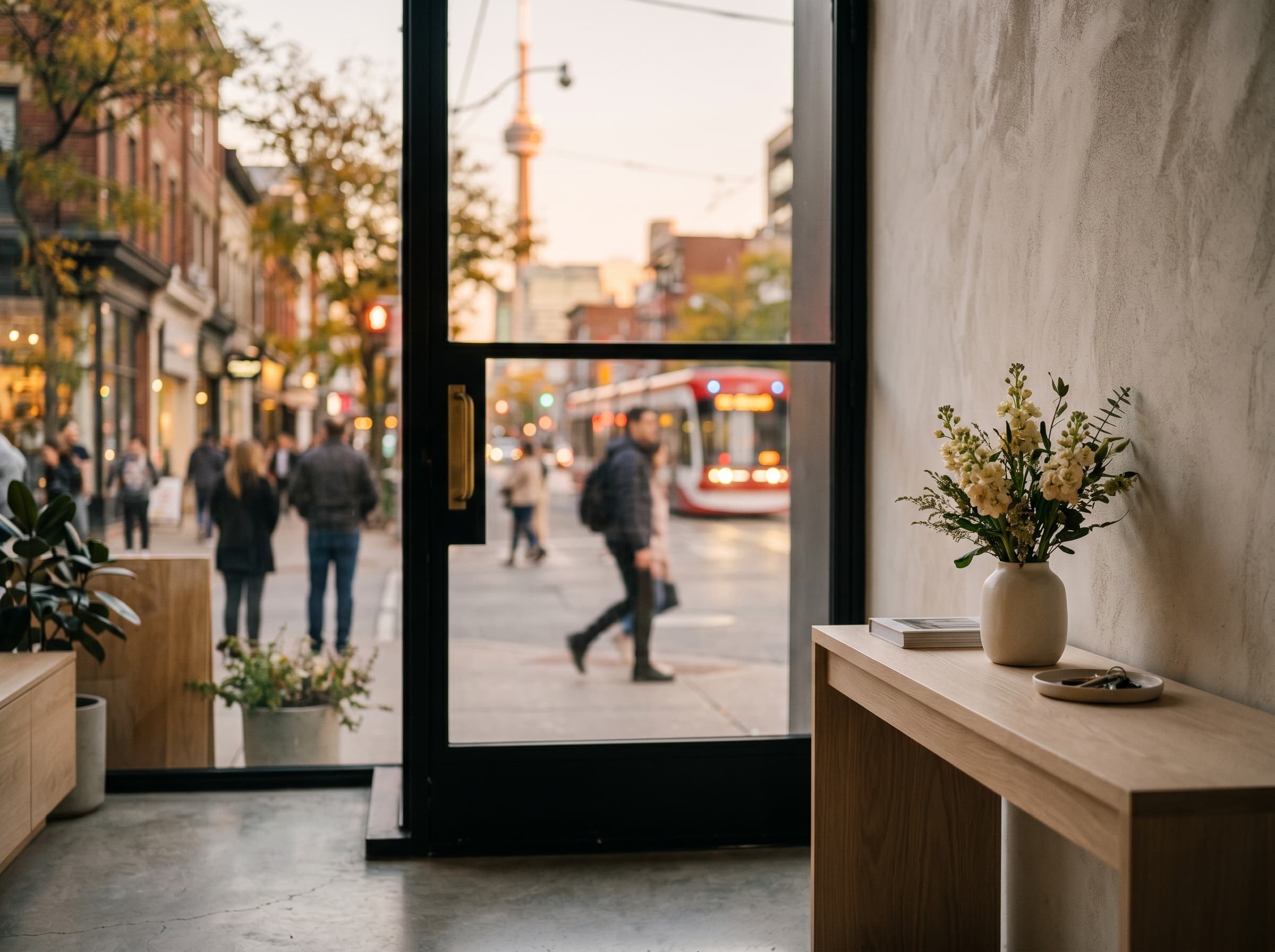
Beauty should not ask visitors to fight the interface. This site is designed to feel expressive while staying readable, navigable, and open to different ways of moving through it.
Bloomwork aims for a site that can be read, navigated, and used by people with different devices, attention levels, vision, motor control, and motion comfort.
We review the experience as the site changes, especially on the routes that matter most: home, services, journal, seasonal calendar, and contact. If something blocks you, tell us and we will treat it as part of the work.

Pages are built with landmarks, ordered headings, visible links, and a skip link so visitors can move through the site without having to watch every animation or use a pointer.
The site honors reduced-motion preferences. The large reveals, gallery movement, and particle field are softened or bypassed when a visitor asks their device for less motion.
Portfolio images include descriptive alt text where the image carries meaning. Decorative texture and atmosphere stay quiet so screen readers do not have to announce visual filler.
Visitors can reach the studio by email, phone, or the inquiry form. Required fields are labeled, errors appear close to the field, and no account is required to start a conversation.
Some motion-heavy gallery moments are intentionally cinematic, even though reduced-motion visitors receive a calmer path.
Older browsers may not receive every transition treatment, but the same pages, links, and inquiry paths remain available.
Third-party surfaces linked from this site, including Instagram, are outside Bloomwork control.
If a page, animation, form, or piece of content is hard to use, write us with the page and what happened.
Last reviewed April 2026